Displaying the time during tests
A year ago, I wrote about how the ability to tell time on an analog clock was going the way of the slide rule. Watches, digital and analog, have largely disappeared. Why wear one when you have a cell phone to tell you the time? While watches do seem to be making a comeback as a fashion accessory, that particular trend hasn’t hit my campus yet judging by my students’ bare wrists.
For a student who doesn’t have a watch and can’t tell time using the analog clock in the back of my classroom, pacing oneself during a test in my classroom is a tricky business.
I project the time using my classroom’s computer.
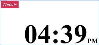
After much looking around, I’ve settled on time.is as my time website of choice. This is what it looks like to my students.

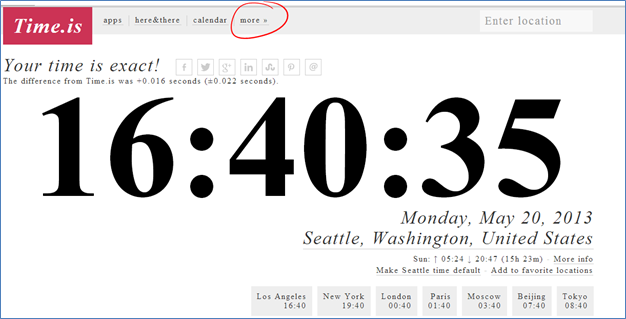
The screenshot below is what Time.is looks like when I first visit the site. It correctly identifies my location as the Seattle area. The information provides is a little much for displaying during a test. Most of my students don’t use a 24-hour clock. Displaying the seconds might actually increase anxiety (“Oh no! Time is going really fast!”). My students don’t need to know that my computer’s time is exact (but good for my computer!). They also, while taking a test, don’t need to know the time in Beijing.
Let’s customize.
First, clicking on the time strips away everything except for the “Time.is” logo in the top left corner and the big bold time in the center; you get a screen that looks like the screenshot that led off this blog post. Click on the time again to go back to the default view that shows all the extras.
Let’s change the display to a 12-hour clock and ditch the seconds.
At the very top of the Time.is screen, click “more.” Then select “customize.”

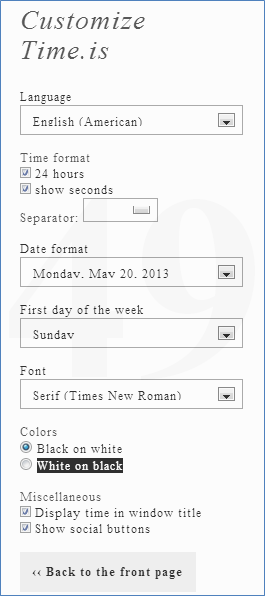
That generates this customization screen. Uncheck “24 hours” and “show seconds.” Then click “Back to the front page.”

Ta da! You now have a 12-hour clock and the seconds are gone.
Click on the time to show just the time. Done!